
Joost Swarte


Wooden Puzzle 'House' - Joost Swarte
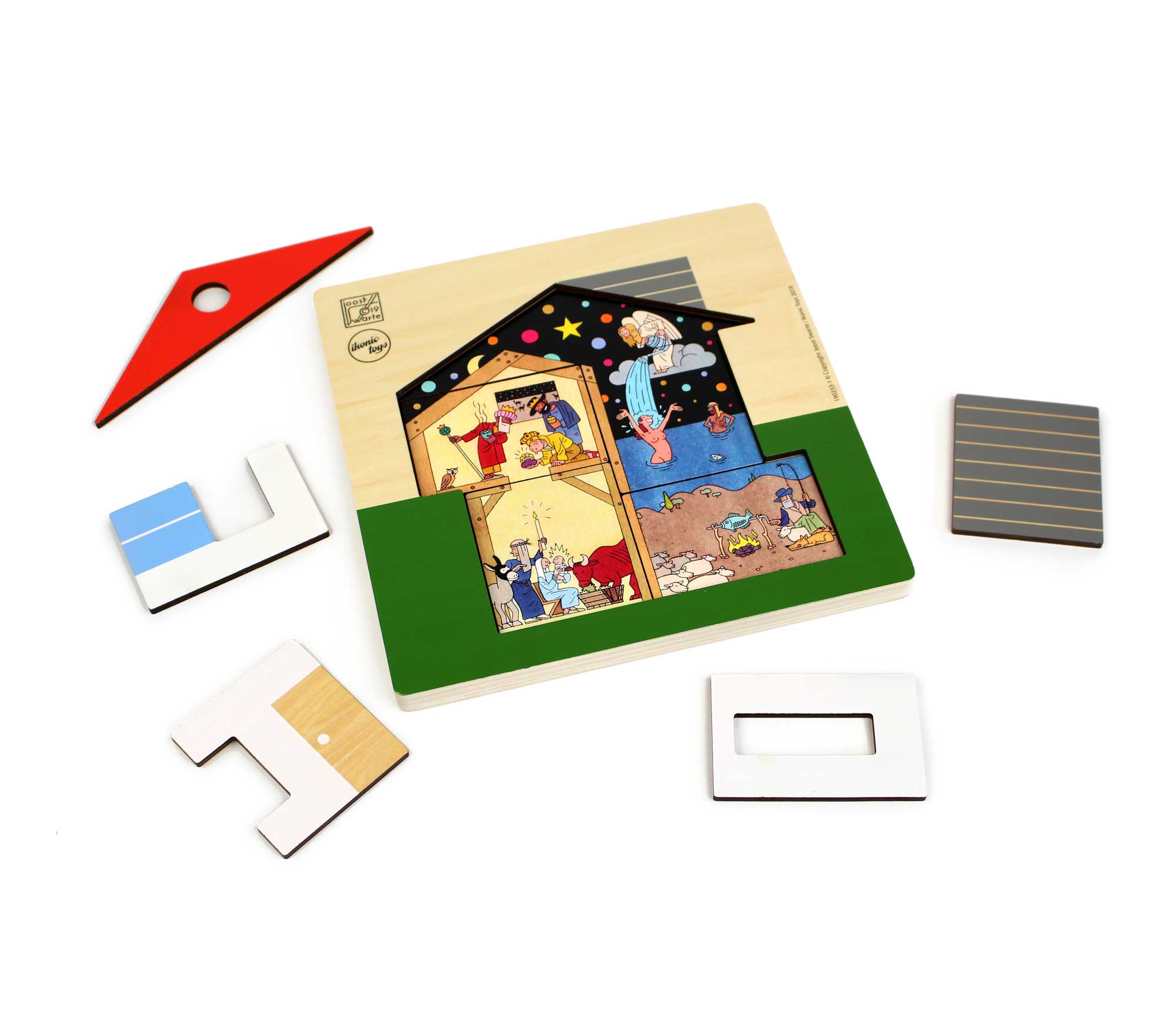
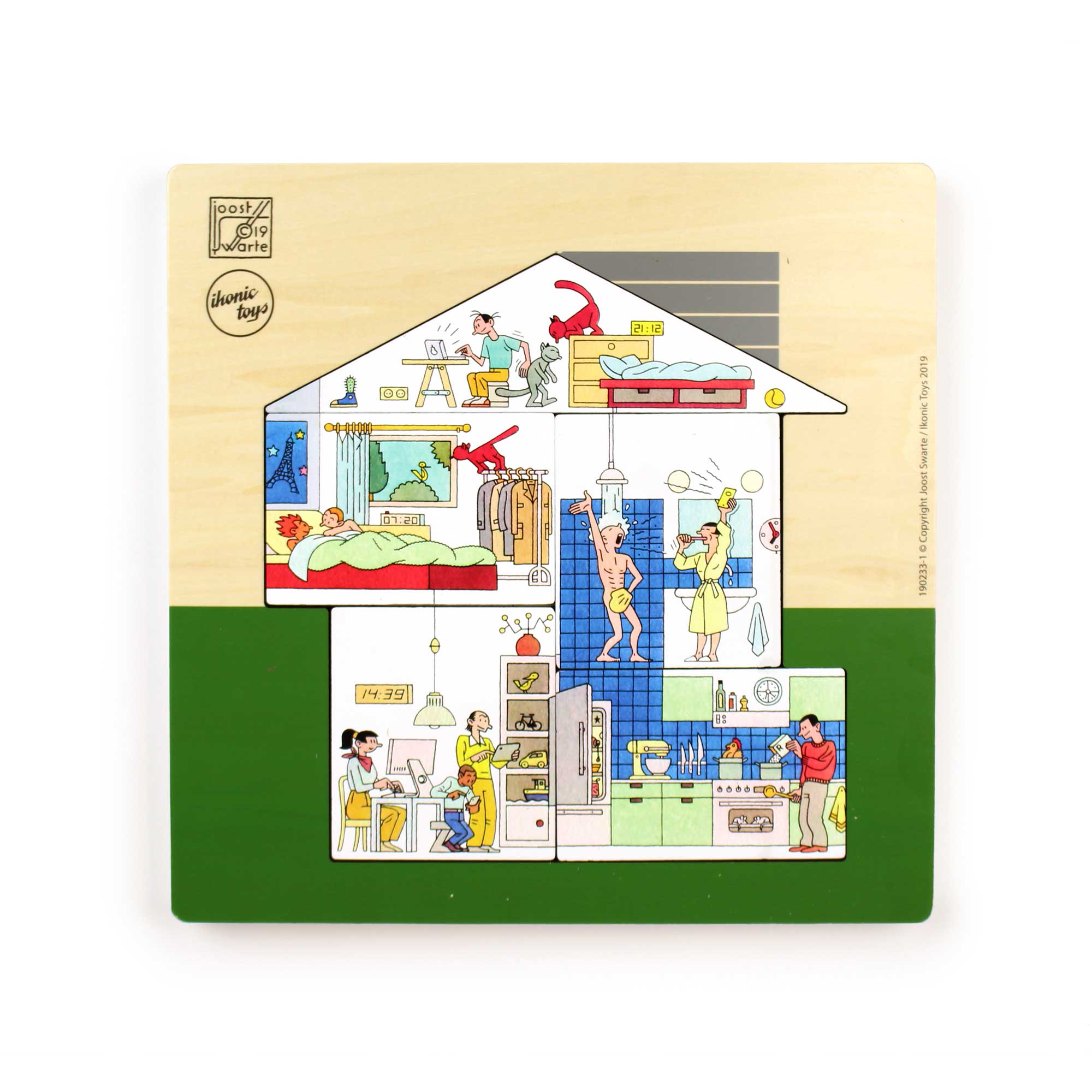
Wooden “House” Puzzle with illustrations by Joost Swarte
A three-layer wooden puzzle featuring wonderful illustrations by Joost Swarte.
'The Times They Are A-Changin' (Bob Dylan)
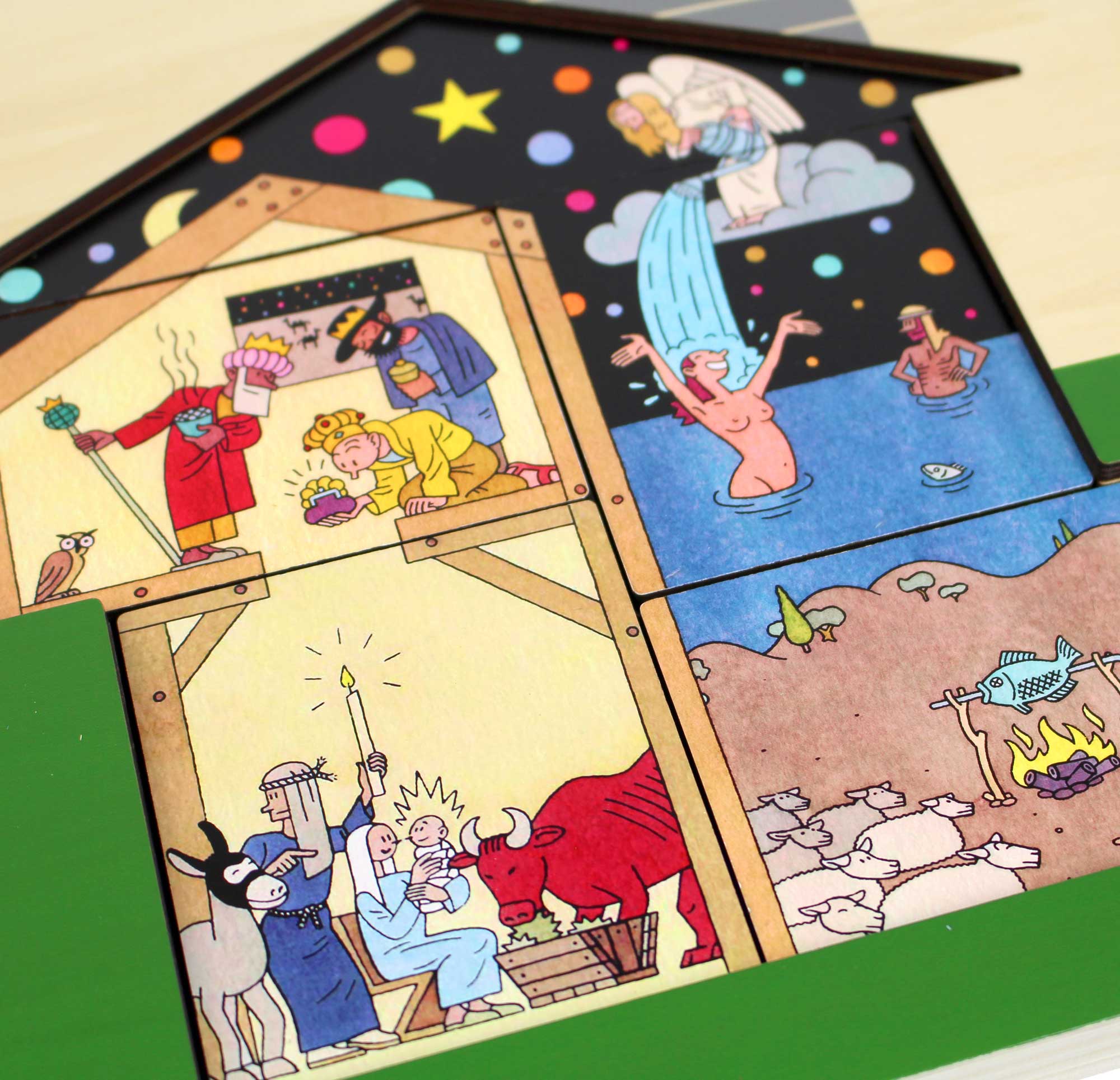
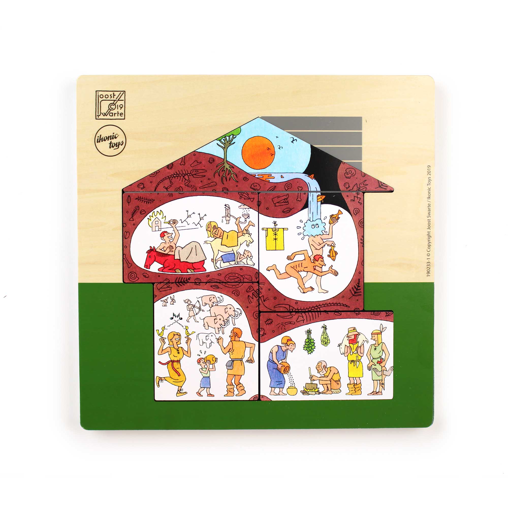
This house has changed over time, from prehistory to the birth of Christ, through the Golden Age to the present day. But feel free to arrange the house however you like, and mix up history!
Each puzzle piece depicts a room in the house:
- the living room, bottom left
- the kitchen, bottom right
- the bedroom, centre left
- the bathroom, centre right
- the attic
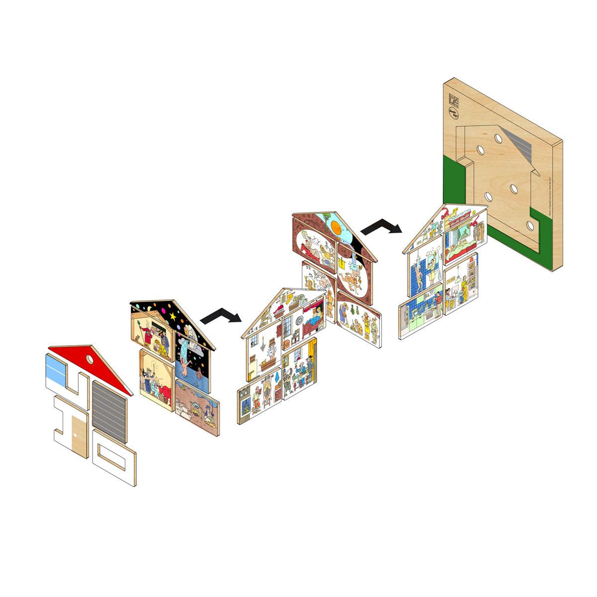
The jigsaw consists of three layers, two of which are double-sided and printed in full colour. The illustrations on the jigsaw pieces: the year zero, with illustrations of the birth of Christ, the Golden Age, prehistory and a layer featuring jigsaw pieces from the present day.
The top layer is the façade of the house, with windows through which the illustrations behind are visible. A really fun and educational puzzle with wonderful illustrations and details by the master artist Joost Swarte.
- Material: birch
- 15 pieces
- Puzzle dimensions: 30 x 30 x 2.3 cm
- Ages 3 and up
#joost swarte #comic puzzle #comic drawing #illustration #joost swarte puzzle #comic book puzzle #puzzle of the day
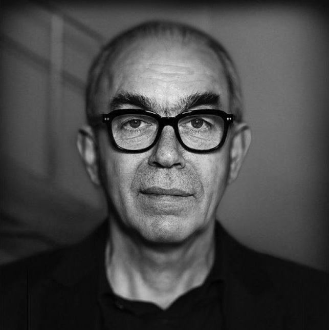
Joost Swarte - comic artist, architect, designer
Joost Swarte (1947) graduated as an industrial designer, but has made a name for himself as a comic artist since the 70s, and has built an impressive career. What did he not do? He started his own comic magazine, designed record covers, magazine covers, started a publishing house, designed stained glass windows, buildings, furniture.....
The comic book author came up with the concept of clear line as a defining stylistic feature for his work at the end of the 70s at a Hergé exhibition in Rotterdam, "Tintin in Rotterdam". The drawing style has clear contour lines, clear color areas without perspective effect via shadow without details. This gives the effect of a maximum and unambiguous legibility of the drawing.
In 2004, Swarte was knighted by Queen Beatrix as Officer in the Order of Orange-Nassau. In recent years, Swarte has made many illustrations for The New Yorker magazine, recently the work of Joost Swarte for the magazine was bundled in the 'New York Book'. His most recent work included designing a fashion show for a major French fashion house.
More about Joost Swarte: Master of the Clear Line
Joost Swarte is not only one of the most influential Dutch comic artists, but also a versatile artist who has left his mark as an illustrator, graphic designer and architect. Joost Swarte was born on December 24, 1947 in Heemstede. He has renewed the international comic world with his recognizable style, the so-called 'clear line'. Thanks to his groundbreaking work, his name is a household name at home and abroad. In this extensive article you can read all about Joost Swarte, his most important works, his influence on Dutch comics, international successes, awards, sources of inspiration, exhibitions and more.
Who is Joost Swarte and what is he known for?
Swarte studied industrial design in Eindhoven, but his passion for drawing won out over his studies. At the end of the 60s he started making comics. He gained his first fame in the Dutch underground comic scene, partly through the magazine Modern Papier and through contributions to magazines such as Aloha and Tante Leny presenteert!. Swarte's fame grew when he designed an iconic series of Children's Welfare Stamps in 1984 that were distributed throughout the Netherlands. In the same decade, he broke through internationally thanks to collaborations with Charlie Mensuel (France), RAW Magazine (USA), and later he illustrated extensively for The New Yorker. Swarte's versatility was evident in his work for both children's and adult magazines and in his design work for books, LP covers, posters and even furniture, among other things.
In addition to his comic work, Swarte is also a visionary designer and architect. For example, he is (together with Mecanoo) the designer of the De Toneelschuur theatre in Haarlem and of striking stained glass windows in the Palace of Justice, Arnhem and other iconic projects.
Joost Swarte's drawing style: the Clear Line
Swarte is seen worldwide as the master of the clear line (ligne claire), a comic style that combines sleek drawings and bright colors with great readability. This style was originally developed by Hergé, the spiritual father of Tintin, but Swarte has further refined and renewed this technique:
- Tight, even contour lines without 'noise'
- Limited and careful use of color without unnecessary shadows
- Little to no shading or textures for maximum image contrast
- Great sharpness and clarity for the viewer
- Playful, sometimes absurd details that only become apparent on closer inspection
His compositions are seemingly simple, but are technically and substantively sophisticated. Swarte's more precise than exact drawing technique makes his work instantly recognizable and universally accessible; a trait that has made him popular with a wide audience.
What characterizes the clear line in Joost Swarte's work?
The term clear line was introduced by Swarte himself as a style term at a Hergé exhibition in the late 1970s and has been in use worldwide ever since. The style revolves around clean, pure lines without shadow or shading and about keeping a drawing immediately legible. In Swarte's vision, the image must not only be technically correct, but also communicate the story clearly at a glance. This direct narrative style creates room for interpretation and a subtle play with irony, humour and social criticism. Swarte is masterful in integrating cultural, architectural and design influences, from Mondrian and Rietveld to Escher, into his drawings. As a result, his work feels both international and unmistakably Dutch.
Influence on Dutch comics: the innovator and the ambassador
Joost Swarte's contribution to Dutch comic culture can hardly be overestimated. He gave the comic strip status as an independent art form, partly due to his innovative contributions to the underground movement, his role as a mentor, and his promotion of the term clear line. In 1992, Swarte was the initiator of the Stripdagen Haarlem, now the most important comic festival in the Netherlands. He was also co-founder of the publishing house Oog & Blik, which paid attention to quality comics and author comics. Swarte's unique combination of underground influences and classic comic aesthetics took Dutch comics to a higher, internationally recognized level. His work is cited by younger comic artists from the Netherlands, Belgium and France as a great source of inspiration.
Most important works and international successes
Joost Swarte has built up an extensive oeuvre, ranging from comics to applied art and architecture. His most famous comics and designs:
- Comics and cartoon characters: Cotton and Pinbal, Jopo de Pojo, Anton Makassar, Dr Ben Cine, Not so, but so
- Albums: Modern Art, Almost Complete, Black Comics
- Designer's work: Children's Welfare Stamps (1984), numerous posters (including for North Sea Jazz), stained glass windows for the Palace of Justice Arnhem, theatre De Schuur in Haarlem, furniture and book illustrations
- Covers and illustrations: More than 8 covers and over 150 illustrations for The New Yorker. Work for Humo, Vrij Nederland, Abitare and many other (inter)national magazines
In addition, his works have been translated into at least five languages: English, French, Spanish, Italian and German. Swarte gained international recognition in 1980 with his participation in the Salon International de la Bande Dessinée in Angoulême, the most important comic festival in the world.
Which international journals does Joost Swarte work for?
Joost Swarte is a much sought-after illustrator. He signed for, among other things:
- The New Yorker (USA): dozens of covers and hundreds of illustrations ('spots')
- RAW Magazine (USA): groundbreaking comic magazine by Art Spiegelman
- Charlie Mensuel / Charlie Hebdo (France)
- Humo (Belgium), Vrij Nederland (Netherlands), Abitare (Italy) and various other magazines worldwide
His clean and accessible style makes his illustrations highly sought after for both editorial and commercial assignments. It is not uncommon for his covers to make an edition of The New Yorker, for example , extra iconic.
Sources of inspiration: where does Joost Swarte get his ideas from?
Joost Swarte's sources of inspiration are diverse and cover art, architecture, design and the comic strip tradition itself. In interviews he mentions:
- Classic comic artists: Hergé, Edgar P. Jacobs, George McManus, Mark Smeets
- The Bauhaus and constructivist art: visible in composition, typography and architecture
- The urban environment and modern life
- Scale models and applied art
- The creative space in dialogue with clients and other artists
Swarte emphasizes his curiosity as a motive: 'Because I can live frugally, I manage to have curiosity as my main motive, instead of money.' As a result, his work is always fresh, innovative and inquisitive in tone.
Joost Swarte's Honors and Awards
Joost Swarte received a lot of recognition for his work, nationally and internationally:
- 1981 – Best foreign artist at the Prix Saint-Michel in Belgium
- 1998 – Stripschapprijs (Netherlands, for the entire oeuvre)
- 2004 – Officer in the Order of Orange-Nassau (decoration by Queen Beatrix)
- 2008 – Award of Excellence (Communication Arts Magazine, voor een The New Yorker-cover)
- 2012 – Marten Toonder Prize (highest Dutch comic award)
- 2018 – Vlag & Wimpel (for the book En toen De Stijl)
These awards underline the international appeal and enduring relevance of his work.
Major exhibitions about Joost Swarte
Several retrospective exhibitions have been devoted to Joost Swarte. The most important are:
- Kunsthal Rotterdam (2020): 'Joost Swarte everywhere' – anniversary exhibition about 50 years of artistry with a focus on his work as a comic artist, illustrator, architect and designer. More than 300 works were shown, including original drawings, design sketches and applied art.
- Hergé Museum (Louvain-la-Neuve, Belgium, 2010): presentation of Swarte's visual and applied work with a particular focus on the interface between comics, design and architecture.
- Salon International de la Bande Dessinée (Angoulême, France, 1980): breakthrough as a comic artist on an international scale.
During the Haarlem Comic Days, which he co-founded himself, Swarte has also regularly been honoured with thematic presentations.
Frequently Asked Questions about Joost Swarte
- How many languages have Swartes comics been translated? in any case English, French, Spanish, Italian and German.
- Is Swarte also an architect? Yes, together with Mecanoo he designed the De Schuur theatre in Haarlem, luxury apartments in Amsterdam and various stained glass objects, in addition to his graphic work.
- What influence did he have on the worldwide comic strip? He introduced the name clear line worldwide and is considered a pioneer in the field of quality comics. His work is particularly highly appreciated in France and the US, including publications in RAW Magazine and The New Yorker.
- Are there any well-known artists influenced by Swarte? Yes, younger comic creators and illustrators from the Netherlands, Belgium, France and beyond recognize Swarte as an important source of inspiration.
- What is typical of 'Joost Swarte'? His solid, clear compositions, an ironic and friendly worldview, subtle social criticism and versatility; his unique crossover of comics, graphics, applied art and architecture.
The legacy of Joost Swarte
Joost Swarte's influence on Dutch and international comic and visual culture is enduring. He gave comics and applied art a new, serious status. His work continues to inspire and innovate, visible in museums, cities and on the covers of leading international magazines. His clear lines, playful designs and versatility have become synonymous with modern visual art. Swarte remains one of the most celebrated and versatile Dutch artists of recent decades; An undisputed grandmaster of the clear line.
